It is a truth universally acknowledged that the majority of labels that adorn the many hundreds of different bottles of wines in the Les Caves portfolio are graphically… humdrum. And that’s being polite. Whilst we know that it is what is inside the bottle that truly matters, in retail people do tend to buy with their eyes. I am afraid that I used to snort derisively, if, when presenting a wine, a customer drew attention to the infelicitous/clunky label. Summoning the bible and Shakespeare in no particular order: good wine needs no bush; all that glisters is not gold etc. even drawing on Prometheus who deceived the gods with a cute piece of repackaging, I argued that zero-thought labels were the direct result of vignerons being entirely unconcerned with material issues and injecting all their creative energy into the wine.
Some of our labels are nondescript in a classical way (italic fonts, yay), others are imaginatively beige, some are Day-glo vulgar, some scream “product styling”, some evidently mean something deeply significant to the vigneron and are deeply cryptic to anyone else, some take minimalism to a low art form, while others rely entirely on a punning name to win you over. And some are just plain shabby.
Given how many natural wines we carry, it is surprising how many conservative label designs we are lumbered with. Some vignerons perhaps treat packaging with a kind of Gallic insouciance – why put any effort into it, whereas others do actually use the label as an opportunity to tell a story, give an impression or a feeling about the wine inside. Thus the labels may become part of the overall wine.
What is good then? Of course, that is a matter of highly subjective taste. Personally, I enjoy artwork – from a childish scribble to a cartoon or caricature to something more colourful and abstract. I prefer good quality matt paper rather than glossy. And that embedded in the design is some meaning that relates to the wine or the winemaker and their philosophy.
Here are a few of my favourite labels:
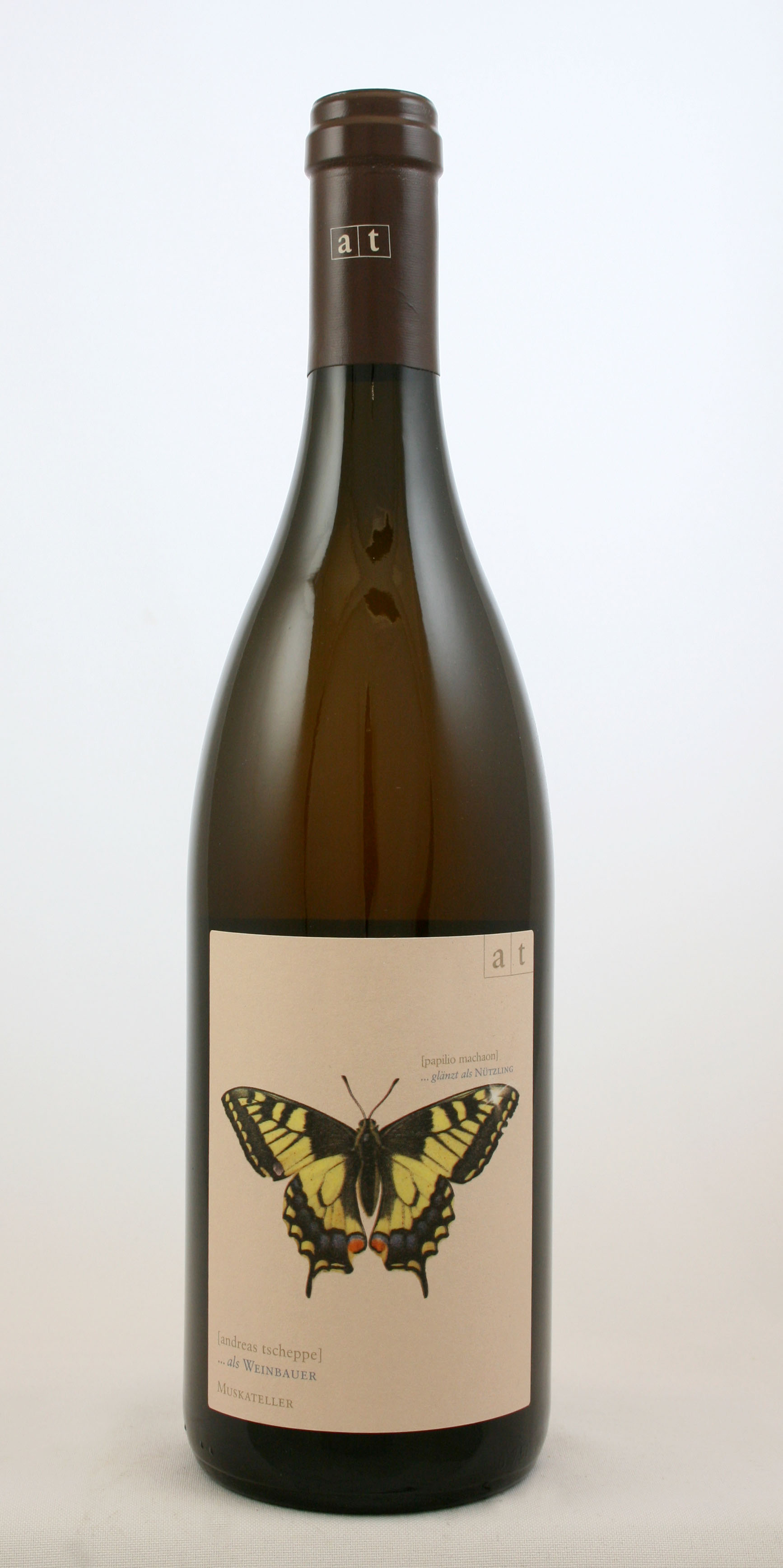
- Andreas Tscheppe: All wines. These are the encyclopaedia entry labels, beautiful and elegant drawings/painting of the entomological (and other) denizens of these biodynamic Styrian vineyards – butterflies, dragonflies, salamanders and stagbeetles.
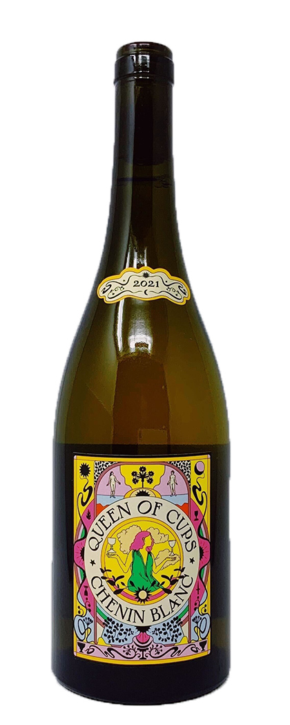
- Ashleigh Barrowman (all). Her striking labels are decked with motifs from the Tarot deck – Queen of Cups, Queen of Swords, High Priestess- each a symbolic representation of the nature of the wine within.
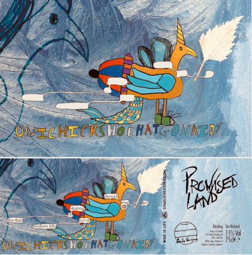
- Charlie Herring (all) – Serious, playful and provocative – wine is the catalyst for many conversations.

PN17 (Photo credit: Ben Walgate) - Tillingham PN – Striking screen-printed bottle visible from the next county along.
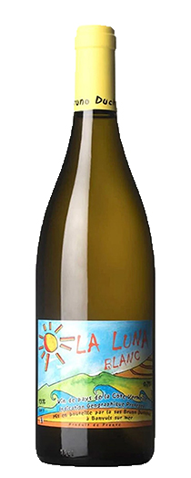
- Bruno Duchene (all) – All aboard the Fauve train to Collioure where sun, sea and vineyard merge.
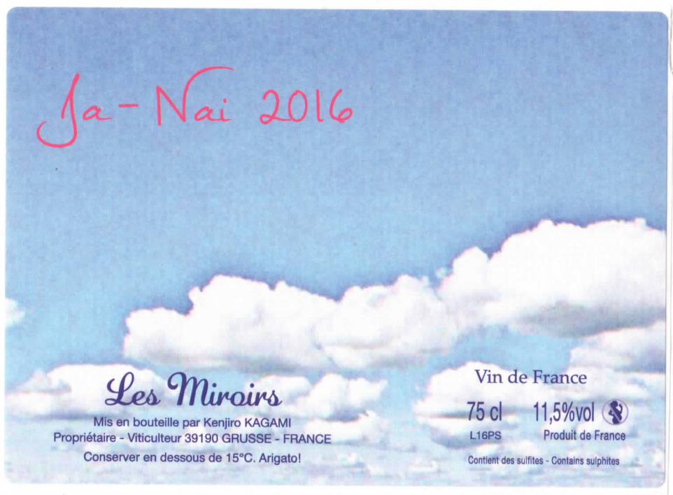
- Miroirs (all) – Clouds of glory, where wine mirrors nature.
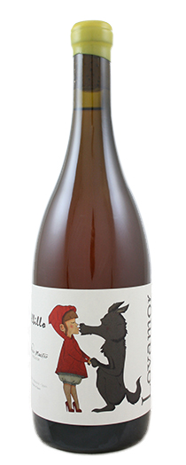
- Alfredo Maestro – Lovamor – More love for Lovamor with Red Riding Hood snogging the friendly wolf.
- Podere Le Boncie – Le Trame – Lowry-esque.
- Paolo Bea (all) – Manuscript labels as if discovered in an ancient monastery.
- Vino di Anna Vendredi 13 – Tolmer label of fire and wine. Volcanic immersion and celebration.
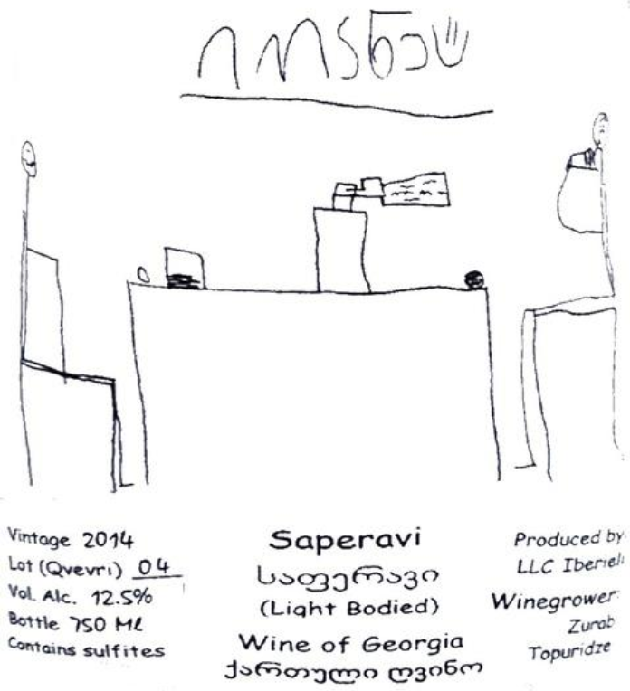
- Zurab Topuridze – Saperavi & Cecilia – Stick people having a great time – wine is family.
- Igavi (all) – Various artists’ interpretations of the concept of Georgian wine folklore – tradition is part of present and future.
- Kelley Fox (Mirabai) – Pinot Noir, Nature and spirituality.
- Lo-Fi (all) – Vine-all. Easy-drinking funkahol.
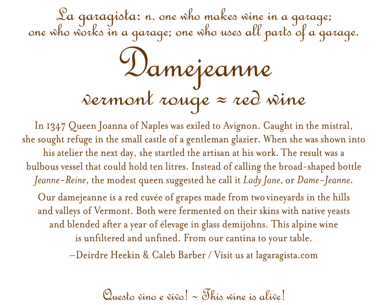
- La Garagista (all) – Labels with lovingly-related stories of origin.
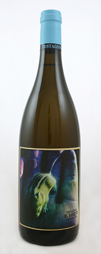
- Testalonga (all) – Tactile labels. Striking street art studded with messages.
- Intellego (most) – Bold and colourful, the visual flavours of the Swartland.
Where there are so-called iconic wines, the iconic labels may be appreciated by many – despite their possible lack of artistic merit. Well, we’ve grown used to them to over the years. Also, the label should not be considered isolation in our evaluation – how it sits on the particular bottle is almost as important. Of course, we are not allowed to love glass, especially those sturdier bottles with their distinct aura of permanence, due to the environmental cost of manufacture, transport and recycling. Yet the effect of a great label is undoubtedly diluted if applied to a cheap, light bottle. This is not a blog, opposing ethics and aesthetics, however.
For me, the best label works to stir the imagination, awaken memories and ignite expectations. A beautiful wine loves beautiful clothes (although I have frequently said elsewhere that good wine needs no bush), and there is something about the complete package, when wine and appropriately stylish design seamlessly align, that adds a certain lustre to the experience of buying and drinking wine.
*
Interested in finding out more about the beautifully labelled wines mentioned? Contact us directly:
shop@lescaves.co.uk | sales@lescaves.co.uk | 01483 538820